Saints and symbols: Former church designer has something to say about new LDS logos

Graphic designer Randall Smith, owner of Modern8 Design, shares his opinion on the latest symbol and logo designs recently introduced by The Church of Jesus Christ of Latter-day Saints.

The new, digitally friendly logo unveiled April 23, 2020, for The Tabernacle Choir at Temple Square. It will be the sixth logo since 1903.

New symbol of The Church of Jesus Christ of Latter-day Saints unveiled April 4, 2020, by President Russell M. Nelson.
The emphasis The Church of Jesus Christ of Latter-day Saints has put on the name of the church came full circle during April’s General Conference with the introduction of a new symbol to identify the faith.
President Russell M. Nelson unveiled the Thorvaldsen statue of the Christus, a statue that has become iconic to the church, as part of that new symbol or logo.
However, at least one designer believes the symbolism should have been more in keeping with the modern church as it moves forward in time rather than staying in the 1800s.
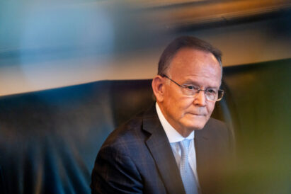
Randall Smith, owner of modern8 in Salt Lake City, said he is not surprised the church settled on the Christus.
“It’s a very safe logo,” Smith said. “It’s sweet, safe and expected but not progressive.”
A church statement concerning the new church symbol said, “This new emblem emphasizes the name of Jesus Christ and His central role in all the Church does.”
The symbolism is described in the following church statement: “The name of the Church is contained within a rectangular shape that represents a cornerstone. This idea has biblical roots. The Apostle Paul, employing a construction metaphor in a letter to the first century Saints in Ephesus, wrote that the Church is built upon the foundation of apostles and prophets — Jesus Christ Himself being the chief cornerstone. The center of the symbol is a representation of Thorvaldsen’s marble statue, the Christus. Jesus stands under an arch as a reminder of His emergence from the tomb three days after His death.”
The symbol portrays the resurrected, living Lord reaching out to embrace all who will come unto him, Nelson said.
“This symbol should feel familiar to many, as we have long identified the restored gospel with the living, resurrected Christ,” Nelson added.
Smith worked in the design department of the church from 1972 to 1979, after which he left to start his own design company.
“I was on the design team for the first church logo,” Smith said. “At that time every department had its own look and feel.”
He said at that time the church wanted to introduce a new look and put emphasis on the name.
Other Christian denomination images and logos contain crosses, crests, lettering and more.
The Catholic Church maintains symbols for saints and apostles as well as the Virgin Mary. There are crests and shields for every internal organization from The Knights of Columbus to Saint Patrick’s Cathedral.
Protestant denominations utilize the cross, and other designs representing everything from fire to the Tree of Life to the Ichthus Fish meaning Christ or Christ, the Fisher of Men.
Noticeably, there are very few Christian denominations that have one or two fixed symbols representing the church and less that actually use the image of Christ.
Smith said that in meeting with the First Presidency during those early days, they decided to use typeface and wording to represent the church. By the mid-1980s, the words “Jesus Christ” were enlarged and made the focus.
“They used bespoke custom typeface from Johnathan Hoefler, a typographer in New York,” Smith said.
Even with the changes to the typeface, there was still not the strong representation of the church being Christian, Smith said.
Smith added that over the years he has been contacted by church entities to join in making suggestions and changes, but that he declined.
It wasn’t until the new symbol was introduced at conference that he felt the logo at least had some visual interest.
“Now we’ve got the words Jesus Christ larger plus a picture,” Smith said.
Smith, who has taught design at the University of Utah for 25 years, said there was a connection between architecture and design.
“We (the LDS Church) are more aggressive with architecture,” Smith said. “Like the Cardston, Alberta Temple is a Frank Lloyd Wright design.”
Smith said he would like to see a more progressive, modern technique in the symbolism and branding of the church.
“I’m more attracted to the new Tabernacle Choir logo than the church’s. It’s more modern,” Smith said.
That is exactly what Mack Wilberg, choir director, wanted.
“The Tabernacle Choir at Temple Square has a new look and modern direction, making it even more relevant to listeners and viewers throughout the world,” said the choir press release.
It is also designed for a digital use and for modern social media platforms.
“The new logo honors the visual heritage of the choir and orchestra using contemporary organ pipes,” Wilberg said. “The curve of the organ pipes recalls the domed roof of the Tabernacle, and the strong vertical thrust of the pipes points us toward God. We love how this new look visually represents the work of the choir and orchestra to bring people closer to the divine through music.”
When it comes to the Tabernacle Choir logo, Smith said they used a traditional representation in a more modern way.
Smith believes that is how the new church symbol should have been. It could have a more modern Christ for a more interesting look, rather than a mid-European, 19th century look.
Smith said the desirable outcome of a more modern look would bring a wider appeal. The symbol also could have been more uniquely LDS.
Smith won’t see much change anytime soon. Nelson said the year-long research into what the symbol should be was inspired.
“We have gone to these extraordinary efforts because when we remove the Lord’s name from the name of His Church, we inadvertently remove Him as the central focus of our worship and our lives,” Nelson said.
Nelson, who has given strong emphasis to the correct name of the church in his ministry since at least 1990, said according to a church statement, “When we take the Savior’s name upon us at baptism, we commit to witness, by our words, thoughts, and actions, that Jesus is the Christ.”
Everyone has a right to their own opinion, Smith said. Smith’s would be to push the boundaries of technique and design to find something that is distinct for the church as it moves further into the 21st century.
Local News

Ben McAdams defeats progressives in Utah Democratic primary as he seeks a return to US House
Unpacking Utah’s primary upsets: The race that’s sending ‘shockwaves’ through the Legislature